The Art of Timing: Why Strikes Happen When Society Needs Workers Most
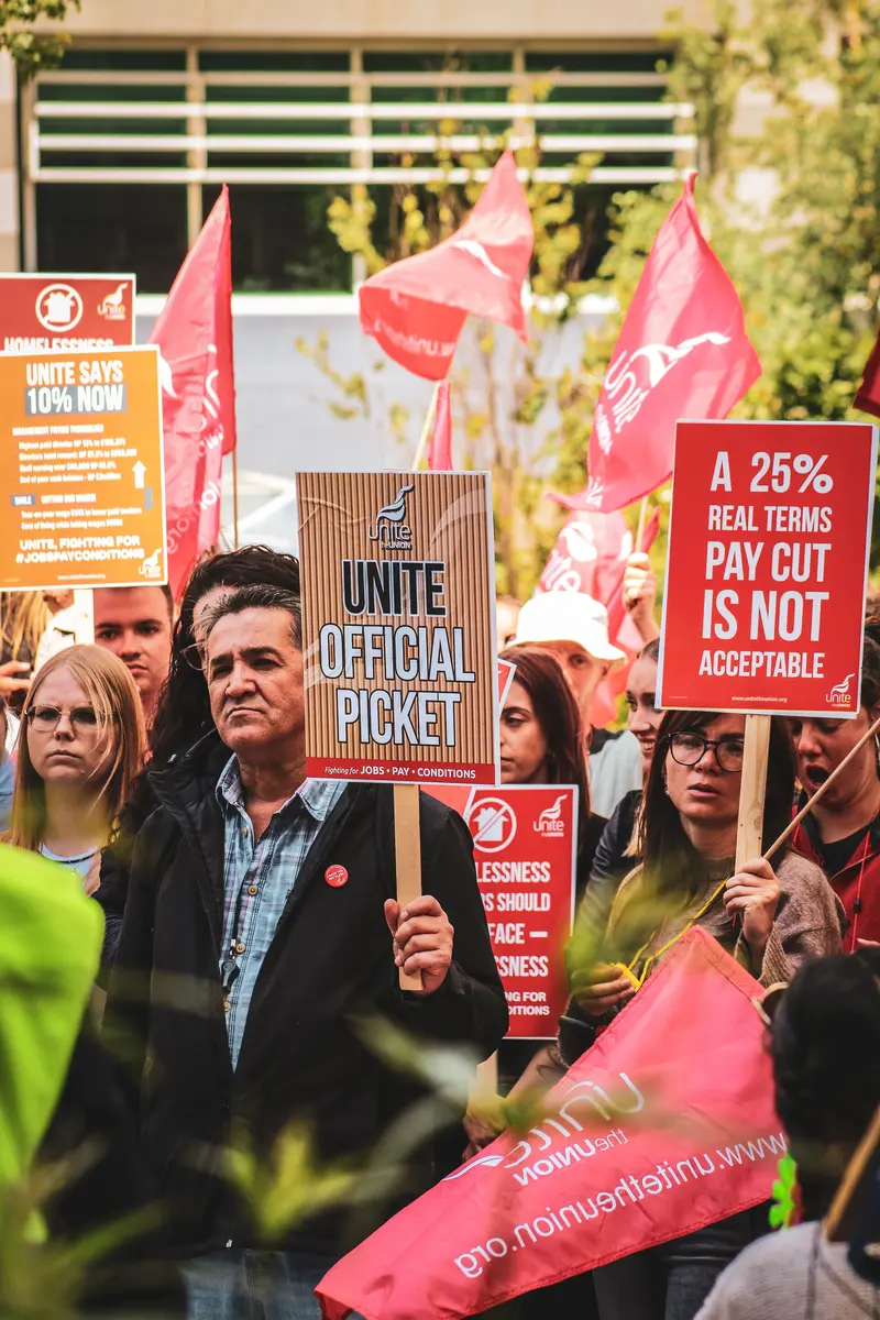
When transit operators strike during exam season, teachers walk out during the school year, postal workers disrupt Christmas deliveries, and stadium workers threaten a walkout before a major sporting event, many people ask the same question: Why now? The answer lies in the economics of bargaining power. A strike that causes little disruption has little leverage. But while strategic timing may help workers win concessions, it also raises difficult questions about the costs imposed on the public.
Read More →


